

How to handle Sugar: Dashboards that really help
A CRM dashboard can be a pretty practical thing. One look should be enough, and you know what is important right now. At least in theory.
In practice, however, dashboards tend to grow over time. Another chart, another list, another metric. Eventually, your homepage displays a lot of information, but barely answers the most important question: What do you need to know or do right now?
Sugar gives you the ability to customize dashboards and so-called dashlets to the respective tasks of a user. The crucial factor is therefore less about fitting as much as possible onto a dashboard. Rather, it is more important to select the right information.
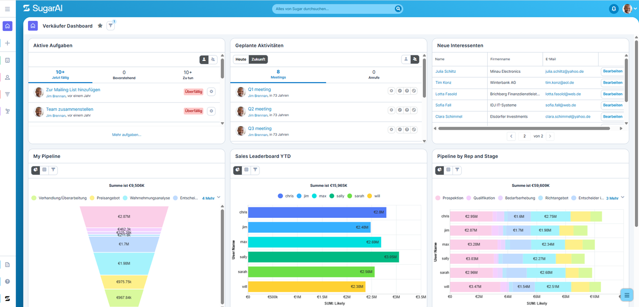
Dashboard and Dashlets: What is What?
In Sugar, a "dashboard" forms a workspace where you can bring together various pieces of information. The individual elements on it are called "dashlets". Depending on the area and configuration, dashlets can, for example, display data records from Sugar, lists, reports, or other relevant information. This eliminates the need for a sales representative to open each module individually to get an initial overview. Important information can converge directly where daily work begins.
A Dashboard Should Have a Task
Before you build dashboards, it is worthwhile to ask a simple question: Which decision or task is a dashboard supposed to make easier for me? For a sales representative, this could mean, for example: Which sales opportunities require my attention? For sales management, the question might rather be: How is our pipeline developing? And in customer service, different information is relevant yet again.
This results in an important principle: A good dashboard is not simply a collection of interesting CRM data. It supports a specific role or task. A dashboard can not only support a user's personal work, but also enable a view of overarching goals. When relevant KPIs of a company, a department, or a team are mapped, it is possible to see at a glance where things currently stand and how key metrics are developing. In sales, these could, for example, be pipeline, incoming orders, closing rates, or other defined sales metrics. In this way, the dashboard connects daily work with the goals by which the success of the team or company is measured.
Selecting Dashlets Selectively
Sugar allows you—depending on permissions and the respective configuration—to customize dashboards and dashlets. When making a selection, however, you should not be guided by everything that can be displayed. It is more interesting to consider what information is needed regularly.
For a sales representative, for example, their own open opportunities, upcoming tasks, sales opportunities with an approaching closing date, or important or newly assigned data records could be relevant. Sales management, on the other hand, might require more aggregated information and reports on the pipeline or the development of sales.
The specific selection of available dashlets depends on the Sugar version used, the licensed features, and the individual configuration of the system.
Less Can Be More on a Dashboard
Precisely because dashboards can be designed flexibly, the temptation quickly arises to fit as much information as possible onto a single page. However, this often leads to the opposite of the desired effect.
When ten or fifteen elements compete for attention simultaneously, you first have to figure out which information is actually important. The dashboard then turns into a search task itself. Prioritization is more helpful: What do you need to see daily? What do you only need occasionally? Which information leads to a concrete action? Anything that does not answer these questions may not necessarily need to be permanently on your main dashboard.
Different Tasks Need Different Dashboards
Sugar supports multiple dashboards so that different work contexts can be separated from one another. But not every information requirement needs to be mapped on a single interface. Instead of building a single overloaded dashboard, you can, for example, structure information by task areas. You could, for instance, use one dashboard for your daily sales work and another for a more analytical view.
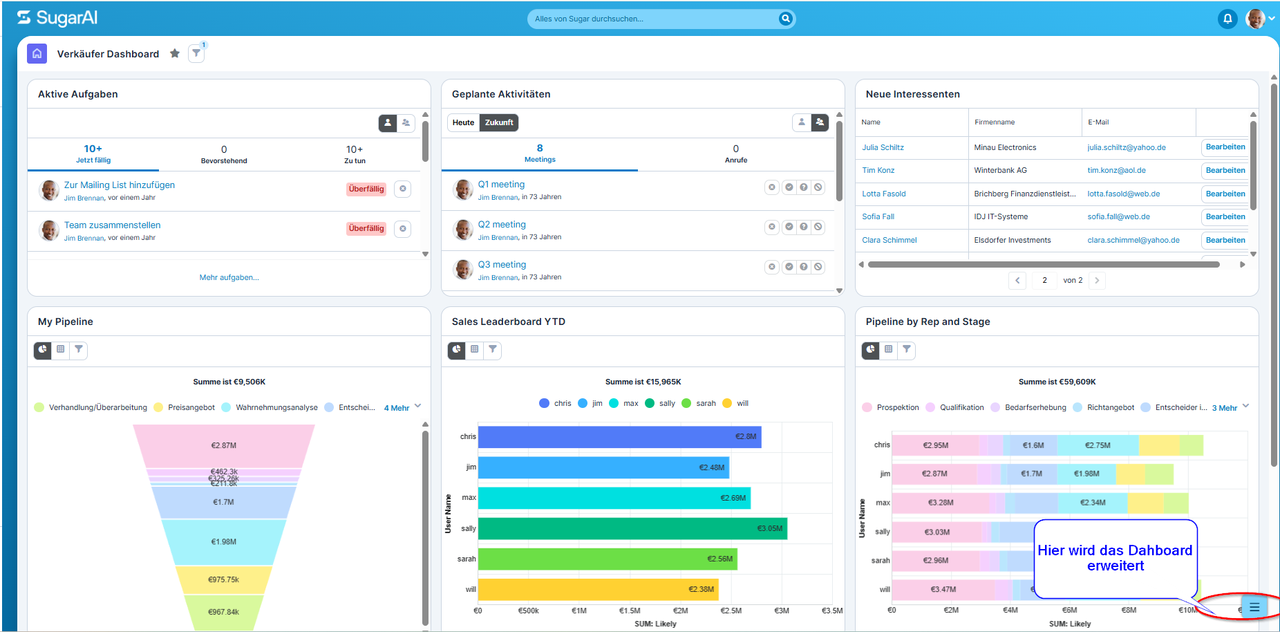
From the Dashboard Directly into Work
Dashboards become particularly helpful when they do not merely inform, but facilitate diving right into further processing. A list of critical opportunities, for instance, is considerably more valuable if a sales representative can see directly which data records require their attention. This also changes the role of the dashboard: it is not just a pretty visualization of CRM data, but can become the starting point for daily work.
Especially at this point, the support provided by AI is likely to become even more important in the future. Instead of merely displaying what happened in the CRM or where a case currently stands, intelligent functions can increasingly assist users in deriving the next steps. Which opportunity requires attention? Which customer should be followed up with? Which task has priority? The dashboard thus evolves from a pure information display into a workspace that actively supports users with their next to-dos.
As with reports and filters, however, the same applies here: the display can only be as reliable as your underlying CRM data. A pipeline dashboard, for example, quickly loses its significance if expected closing dates are not maintained or sales stages are not updated.
A dashboard can even make such problems visible. If metrics or lists regularly seem implausible to you, the cause may lie less in the visual presentation than in the underlying data and processes.
A Dashboard May Change
Even a well-designed dashboard does not have to stay the same forever. Cleaning up a dashboard can make just as much sense as building a new one. After all, your tasks change, sales processes evolve, and some metrics that once seemed important to you are barely used later on.
That is why it pays off to take a critical look at dashboards occasionally: Which elements do you actually use? Which information is missing? And which dashlets are actually only still there because they were added at some point in the past?
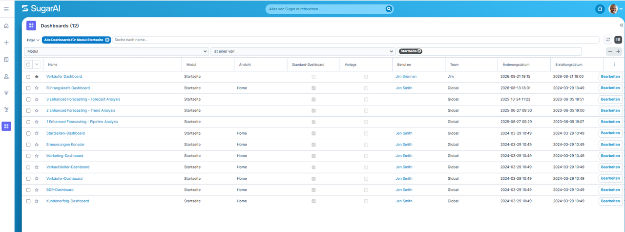
Conclusion: The dashboard as a personal work hub
Dashboards are among the Sugar features where even small adjustments can make a big difference in the daily workflow. Instead of providing users with as much information as possible, a good dashboard should bring together the relevant information for a specific role or task. Then, the CRM homepage becomes more than just an overview: it turns into a personal work hub from which users can start directly into their day.
Do you have any questions? Contact our experts.
We support you both in optimizing your existing CRM and in setting up your CRM functionalities.

Yours Frank Tjaben
Head of Sales
frank.tjaben@login-software.net
+49 89 2020447 25
 login-software.net